
UX Redesigns
Take a look at how I apply UX principles to improve some of the things I encounter in daily life.
Redesigning the Elevator Control Panel of my Girlfriend’s Apt. Building
January 25, 2023
When it comes to elevators, they’re pretty simple: press a button to summon one, walk inside, and then press the floor you want to go to. With the click of two buttons you’re where you need to be. Somewhere along the line, though, someone came up with the idea to have people choose their floor before they get into the elevator to prevent long elevator rides that stop and go from one floor to another. They called it destination dispatch. The goal behind destination dispatch systems is to group and assign users to specific elevators based on the floors they’re traveling to. This leverages the presence of multiple elevators which increases efficiency and reduces travel time for users by up to 30% over the traditional elevator system.
However, this system and its benefits are totally undermined by the elevator control panel at my girlfriend’s apartment building. Its clunky UI muddles and prolongs what should otherwise be a quick and easy button press and promises a frustrating user experience almost every time I use it. It implies a certain carelessness and lack of empathy for the user that I wish to address in this redesign.
The Control Panel in Question:
In this video I am using the control panel to access one of the building’s garage floors. Do you notice any issues? It may be hard to notice much without using it yourself, but here are some issues I’ve picked out with this control panel after extended use:
Pain Points
There is no clear option to backtrack or re-enter the desired floor if an error is made.
The text field is vague and only displays one character at a time. This makes it unclear whether tenants have inputted the correct floor.
Not enough time provided for tenant to input second digit (say, for floors above 9) before assuming tenant has finished inputting. This is a big accessibility issue
The meaning/function of the buttons in the bottom nav bar are unclear.
(Not depicted) The control panel will ask to verify the tenant’s security credential after inputting a floor. The message will obscure the inputted floor until the credential is verified.
(Not depicted) Error messages (such as inputting an invalid floor) replace the entire interface for multiple seconds before returning to the main screen.
The touch sensitivity of control panel is very low, often requiring repeat presses. This often leads to tenants overcompensating for the sensitivity and making more inputs than necessary.
Sketching Solutions
I sketched some potential design solutions after breaking down the issues with the original control panel. The common link between the issues I isolated in the original design is obscuring important information that drives user choice. For instance, why am I being asked to verify my access to a floor I can’t even see? I don’t even know if I inputted the correct floor!
In addition, not providing the user with an option to backtrack ignores the very human tendency of making mistakes.
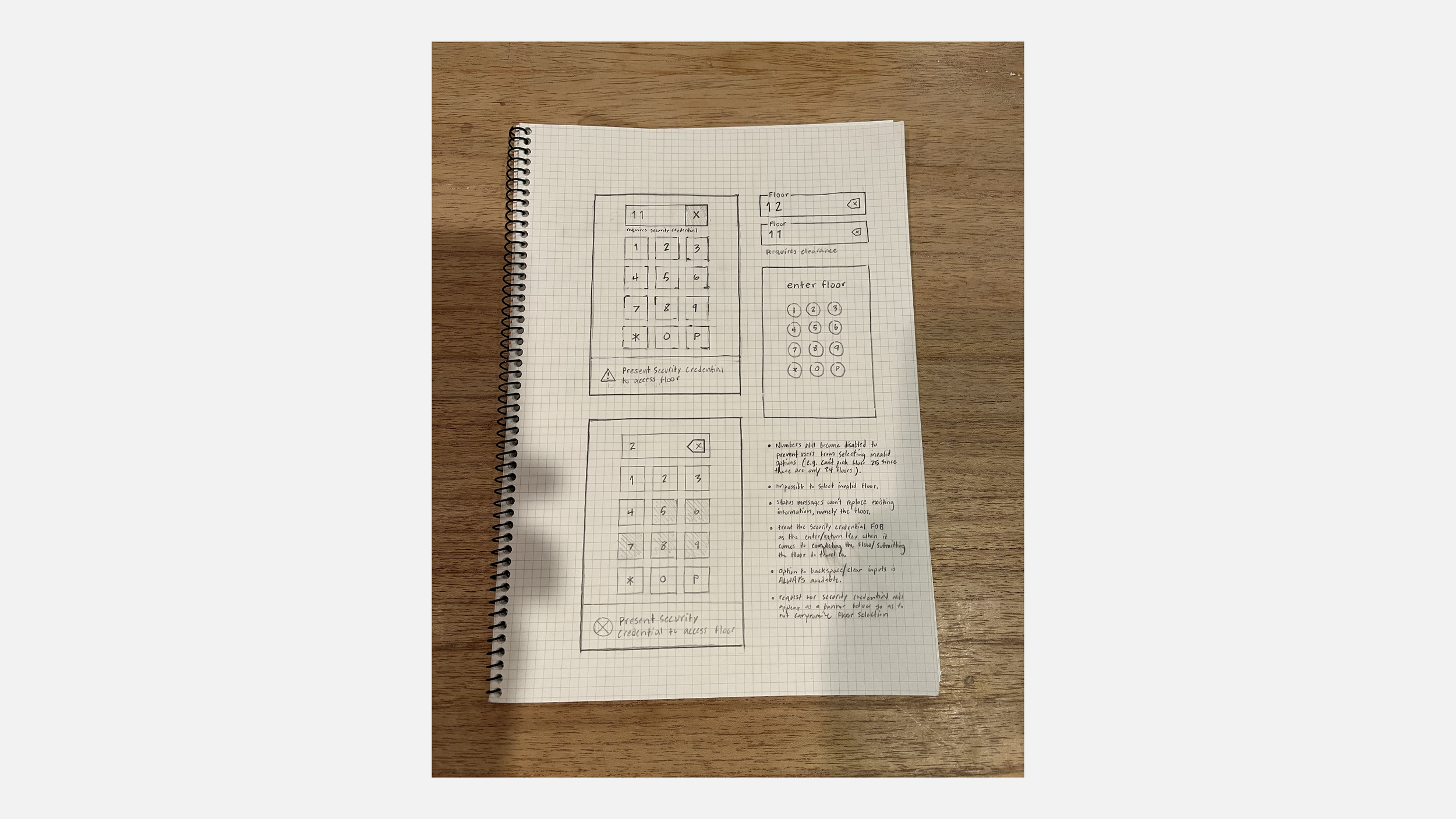
Proposed Design Solutions
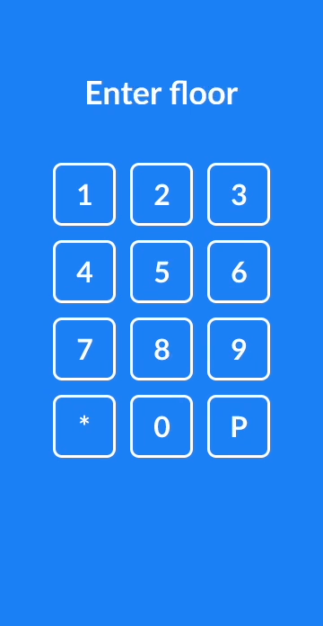
The inputted floor will appear in a well-defined text field to clearly show users what floor they’re entering in the keypad. Multiple digits will be visible at once.
Numbers will become disabled to prevent users from selecting invalid options (e.g. users can’t pick floors above 25 since there are only 24 floors in the building).
Impossible to select an invalid floor.
Status messages will NOT replace existing information, primarily the inputted floor.
The request for security credential notification will appear as a banner below so as to not compromise the text field like in the original panel
The option to backspace/clear inputs is not only available, but ALWAYS available
This solution treats the security credential FOB as the enter/return key when it comes to submitting the floor to travel to.
The Redesign
Users are able to clearly and consistently able to view the floor they’re entering. They can also clear incorrect entries at any point. To avoid unnecessary error messages and dead-ends in the flow, users are no longer able to input non-existent floors. Digits will become disabled after certain combinations (such as numbers 5-9 after inputting 2 since there are only 24 floors in the building). And finally, the notice for security access now takes the form of a banner at the bottom of the screen rather than overtaking the text field, obscuring the chosen floor. The text field will also become highlighted to better establish the connection between the inputted floor and the request for security clearance.